Showing posts with label Industry. Show all posts

Friday, 19 January 2018

Magzine 1 - Lesson 6

To what extent is Woman magazine examples of specialised and institutionalised media productions? Make reference to their distribution and circulation.

  • Magazines are specialised as they target an extremely specific audience so specialised advertisers can have their product advertised to their exact target audience so they may pay a premium.
  • Woman magazine is casual and friendly so it is an institution.
  • IPC is a large mainstream organisation. It is part of a conglomeration.
  • Other IPC titles include Rugby World, World Soccer, Angler's Mail and Family Circle.

Key Theory - Curran and Seaton - Power and Media Industries

  • The media is controlled by a small number of companies primarily driven by the profit and power.
  • Media concentration limits variety, creativity and quality.
  • More socially diverse patterns of ownership can create more varies and adventurous media productions.

Woman Relaunch Advert 1985

  • Still about cooking and women in the kitchen 'high street cookery competition', so they haven't exactly changed their ideologies as there is still a focus on the kitchen.
  • The model looks like she's more dressed up and she's going out.
  • The masthead has changed, the font has completely changed was naive now its full on and it seems informal but a more gossipy mode of address.
  • The competition with 4 cars, if this was in the 1960's then the idea of a women driving would not exist whereas in the 1980's its not anything much different.
  • The audience is still working class so not much has changed at all, due to the clothing they've used to advertise.
  • 'exciting again' shows that the 1964 edition wasn't as good and it went really downhill but now its back and its exciting again.
Promotional material from Time Inc UK's profile page for woman.
  • This is selling audiences, the advertisers which would be interested in woman magazine would be the market of fitness/diet.
  • The brand identity is much more different now.
Regulation of Magazines
  • IPSO - Independent Press Standards Organisations
  • IPSO regulating the stories and editorial content.
  • By todays standards Woman would probably break IPSO's rule of discrimination as they are discriminating women by cultivating ideologies into others heads about the way that women are. 
  • Advertising Standards Agency (ASA) regulates adverts.

Magazine 1 - Lesson 5 - Industry

Magazine Industry - Woman Magazine

  • Brand Identity
    • Brand Identity is how a business presents itself to and wants to be perceived by its consumers, and also how it differentiates itself from competitors.
    • By knowing exactly what audience you're targeting you can include relevant information which will be interesting to your audience and you can also use targeted advertisements as 1/3 of revenue into magazines comes through advertisements.
  • Brand Loyalty
    • Because you're the magazines target audience you will relate and enjoy the magazine so you will carry on to read it and buy it so it creates brand loyalty between the producer and the consumer.

Comparing Brand Identity

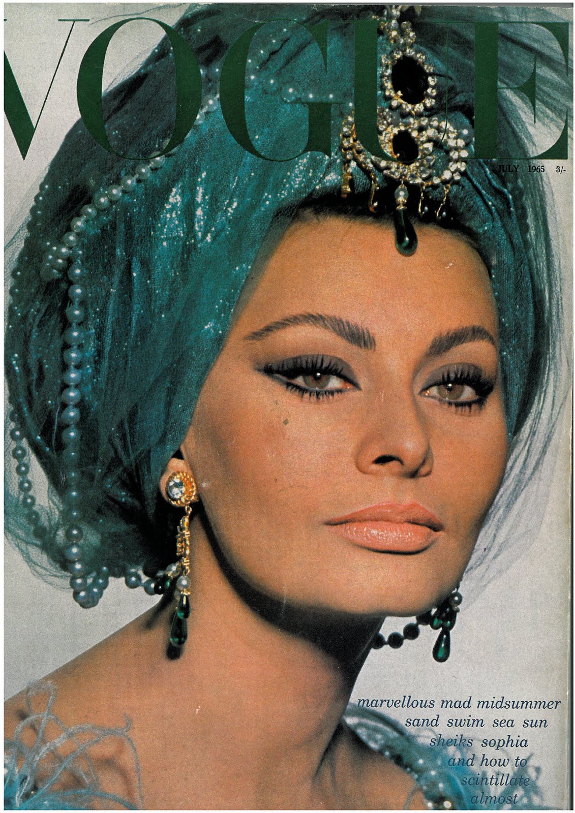
  • The front cover of VOGUE magazine is quite minimalist and classy and modern and looks much more high end compared to the Woman magazine which seems more cluttered and chucked together.
  • The colour scheme's of both magazine's are completely different as VOGUE is all green's and blues with the model taking centre stage and the writing being less important than her. Whereas on the Woman magazine there are different colours, of pinks and whites etc. so the model doesn't stand out as much and she just blends in and the writing is more important due to the model not being known whereas on VOGUE model Sophia is a well known model and actress.
  • The model on VOGUE looks mysterious but also looks smart as she looks like she's thinking and she looks like she is confident and superior whereas the model on woman magazine looks like she is naive due to her smile being a bit silly and fake. Her smile also looks extremely forced its emphasised due to her having an overdone smile, we can see all the bunched up lines on her face and it looks too much which shows that she is in a passive position.
  • Woman magazine wants the world to know that it exists whereas VOGUE doesn't care because if you know you know which gives a snobby mode of address towards the audience, you need to know about fashion to read this magazine.
  • Sophia is 31 in this image whereas in Woman we estimate she is around 35, but the model in woman who looks older is portrayed in a more childish way as of her forced smile, but Sophia who we suppose is younger is portrayed in a more mature and independent way.
  • If the lexis doesn't allow you to read it and understand it then it is restricted lexis, which is what we see with the headlines in VOGUE magazine. 'and how to scintillate almost anywhere'
  • VOGUE doesn't mention anything about kitchens whereas woman magazine mention it on the front cover. So it shows that VOGUE is established as they dont need to sell what is inside the magazine into their consumers.
  • VOGUE is glossy so this connotes the expensiveness of the magazine and you will keep this magazine for years as its a monthly magazine, whereas Woman magazine comes out every week so its one of the magazines that may get chucked away as theres a new one coming out next week.
  • In Woman magazine she is the friendly person from down the road and she is not scary if anything she is probably scared of you compared to VOGUE who is usually the person that everyone is scared off and wants to secretly be like her or be friends with her.

To what extent is Woman magazine specialised and institutionalised media productions? Make reference to their distribution and circulation.


Tuesday, 14 November 2017

Introduction To Newspapers

Introduction to Newspapers

4 Concepts of the A-Level Media:
  • Section A
    • Media Language 
    • Representation
  • Section B
    • Audience
    • Industry
Media Institution

Institution - The values and ideology of a media production. 

Institution and Industry are completely different terms.

Long Road Website Advertising

  • The girl seems quite edgy as she has different coloured hair , this kind of shows that the college is promoting difference and the idea of freedom as the majority of high schools would've kicked you out for having different colours in your hair so it makes the sixth form seem caring for individuality and being different. Also, her quote says 'ready to be independent, to be treated as an adult shows that although they're still a sixth form that they're a big difference to high school.
  • The idea that all the students are different. Jack (Afro) is a bit edgy, and looks a bit afro Caribbean, the connotations of these people are that they are laid back, so it makes the college seem extremely laid back.
  • Josh looks very 'stereotypically' mature or nerdy, which gives connotations that he is sensible and mature, whereas Isobel looks very different and edgy.
  • By using these people, they look very different to the subjects they take, showing that you can take whatever you want and be your own person.
  • Long Road puts across the messages and values that they do to attract students and get money from the government. 
  • Differentiation
  • Competition
  • Identification
  • Ideology 

Logo's - Deconstruction / Textual Analysis

  • Shell Logo
    • Looks like the petrol gauge for your fuel level, also with the red around it, it makes drivers think that there fuel is low and that they are in need to fill up as red connotes danger or emptiness. 
    • Red and yellow symbolises fire and combustion and they will catch your attention if you see it. 
    • The red also symbolises power and royalty. 
    • The shell also looks like a sunrise so it makes you think that its a routine in the morning to go fill up at shell.
    • Sharp lines look fast.
    • 2 colours make it simple and clear.
    • Also bold and powerful.
    • Shell shaped so it shows that it is natural.
  • Starbucks
    • American - has a passing resemblance to the statue of liberty.
    • Green - Colour of money.
    • Soothing and Wavy - Solve that issue by having a coffee. 
    • Mermaid - Stereotypical to a women. 

First Impressions on Daily Mirror Newspaper Front Cover


  • More of a gossip mail rather than news and politics due to the tv shows at the top.
  • Informal as they're using slang terms like 'Corrie Claire' so they're assuming that we know who Corrie Claire is due to her being off of coronation street so they're making large assumptions to who their audience is, due to their being no context 'ITV show Coronation Street's Claire says...'
  • Informal working class gossip magazine.
  • Sensitive issues being joked about and being treated very light hearted and they're using puns, comes from boxing, so you need a lot of knowledge to understand the background of this mail.
  • Quite a lot of images, so the target audience has quite a short attendance span, so theres not much writing at all compared to photo's as they're targeting the working class demographic.
  • Daily Mirror is anti-trump, due to the choice of language. This is the dominant reading that we see this and think 'Trump is disgusting'. Daily Mirror is using dark humour and a pun, a simple source of humour, this suggests that the target audience is quite immature and working class rather than the upper more mature class. The photo used has been selected as it suggests about trump that he is sleazy, creepy and odd.

Revison - Component 2c - Online Media (2 QUESTIONS)

Question 1 How significant is the role of individual producers in online media industries? Make reference to Zoella to support your argume...